My Target Audience (The perfect Viewer)

Fredrick Williams
Age: 21
Occupation: University Student
Job: Part-time restaurant waiter
Enjoys: Performing arts, Social media & pop music
About him: Fredrick enjoys his Uni life, and pursues him ambition to become a performer on the West End. Some may categorise Fredrick as a 'typical teenager', sharing his life on social media, going out with friends and a freunt listener to alternative pop music. Fredrick however pays less attention to music charts such as the UK top 40, and actively seeks to discover sound of the indie pop genre. He often shares his musical interests via his instagram account, where he interacts with others around the world with similar music tastes, and follows the bands he has an interest in.
Fredrick is the perfect example of the audience I am targeting with my media text. Specifically, my target audience lie within the 15-25 year old age range. I am targeting younger people with an interest in indie music and broadening their range or musical interests. My DigiPak, magazine advert and music video will all be centred around appealing to these people and encouraging them to engage in the media texts I have created.
--------------------------------------------------------------------------------------------------------------------------
DigiPak
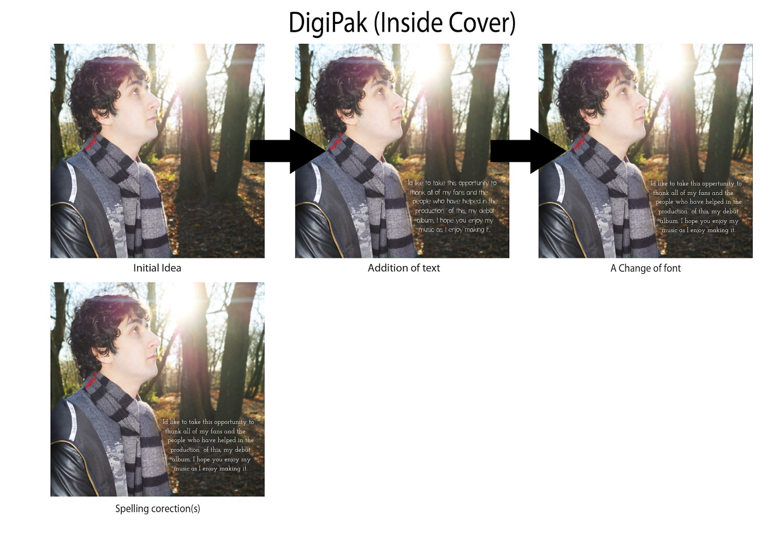
Documenting the evolution of my DigiPak and all of its panels has been quite a journey, with frequent changes of ideas, various edits of chosen ideas and the finishing touches implemented on each of the 6 panels. Below is the almost unrecognisable design of my DigiPak showing my initial ideas for each panel. All but two panels are the idea I actually decided to incorporate in my final product, largely due to the wealth of helpful feedback I received from my peers.

This rough draft of what I intended my Digipak to look like was then converted into an electronic representation. This did not include the front cover or first inside cover due both my audience and me personally not liking the ideas for these panels, which can be seen above.

After another set of feedback I received urging me to rethink the idea behind the back panel too, I was ready to start constructing new ideas for each panel and developing into what I like to refer to as 'masterpieces'. The images provided below show a graphical changelog of each panel, showing how it has evolved from the initial panel idea to the final product through the feedback I received. Below each image states what changes I made to each panel as a consequence of audience feedback.


Once making all the adaptations shown above, I collated all of my final panels into one document, my 6 panel Digipak. I then asked my audience to provide some further feedback on my work.

Despite thinking my Digipak was then complete, after further feedback I received it was pointed out that they were not keen of the panel featuring the the couple holding hands, seemingly looking out of place and creating conflate with the rest of the Digipak's theme and colour scheme. This was also something I later identified as a problem. As a result, I instead incorporated another photograph I took on the day of filming, depicting a close up of barbed wire with the intention of reinforcing my encoded message of the music video that relationships are far from the perfect journey they are so often made out to be in other existing media texts. They can cause hurt, much like the intention of the barbed wire featured in this panel. My audience found some proportional issues with the tree trunk image, claiming it looked stretched. This was later solved by resizing it to its original proportions. The inclusion of the reworked panel, the edges bordering around each panel and fixing the proportional issues with the CD slot panel, completed my final DigiPak, which is exhibited below.

In constructing my magazine advert, I took a rather different approach. I created 3 ideas for my magazine advert, of which I let my audience decide which one they liked the most. Whilst keeping the design layout consistent throughout each idea, the text and photograph used varies between each poster. Beside each option I have listed the feedback I received in relation to it.

Positive Feedback
- Nice text layout
- A good amount of bleed at the edges
Constructive Feedback
- Image to faded
- Same image used on DigiPak only its flipped
- Text looks to informal, scratchy and rough
- Artist Name slightly out of position
- Album name slightly out of position
- Image of artist is too big for the canvas
- Text does not match the font of the DigiPak

Positive Feedback
- Text looks more professional
- Text is consistent with the Digipak
- A nice gradient effect used
Constructive Feedback
- Image looks like he's advertising a gardening show rather than a music album

Positive Feedback
- Again, text looks more professional in comparison to the first idea
- Text is consistent with the DigiPak
- A nice, subtle gradient effect
- Really like the image of the artist, which relates to the actual song
- A clever fogging effect to improve the visibility of text
- Well positioned text with suitable bleed
Constructive Feedback
- The layout should be reshuffled so that the star ratings, critic quotes and 'Out Now' text are situated above the text listing some of the songs that feature on the album
An overwhelming majority of my audience chose idea three to be the most suitable choice. As a result, this is the design I chose to pursuit as my final magazine advert, after the implementation of the change(s) listed in its constructive feedback. Once again, using the constructive feedback enabled me to continually improve my work. This was no exception, with the result of these changes shown below in my finalised magazine advert.

Music Video
By taking on the feedback I have received at every stage of producing my music video, the product has evolved into what it looks like today. However, whilst sharing some similarities, my initial idea was a far stretch from what the end product turned out to be. This is thanks to the constructive contribution of my audience. The feedback I received form my initial idea from my music video along with my first storyboard can be seen below. The video was recorded immediately after my pitch, and enables me to reflect on the feedback I received and how to act upon it.
The feedback received was very useful, and suggested the following adaptations to my rather vague concept idea. The three key points we are as follows:
- Revise death ending (the death of a relationship rather than a literal death)
- Possibly portray the people in the relationship growing up
- Rethink the structure of the narrative
This first set of feedback game some direction to my ideas, being able to generate a far clearer image of what I would like my final product to look like. Whilst tweaking my narrative to accommodate these suggested changes, I quickly moved on to filming the performance element of my music video, something my peers agreed was a good idea. As seen in my animatic, the performance element is mixed with my narrative to create a range of interesting shots, incorporating my artist and his band singing along with telling a fragmented story throughout. My first music video draft visualised only my performance footage, having yet to film any narrative due to the feedback I received. Narrative footage would later replace the black spaces between the performance clips. Despite this being, as the title describes, a 'very rough music video draft', I believe it was a huge stepping stone in identifying the progression of my work.
The verbal feedback I received from the audience viewing this draft was generally very positive. Peers and family members commented on the camerawork, and how they enjoyed the smooth sweeping motion implemented on each clip. The video gave me a strong structure of narrative, of which I could then include my revised narrative. The critical feedback I received for this piece was rather pointing out the obvious. The two key themes of critical feedback I received from people who had just viewed my first draft were to:
- Add a narrative to the music video (fill in the black spaces)
- Find a conclusion/climax for the video
As you can see through my second draft, which can be viewed below, I took this feedback in my stride, using it as an opportunity to sculpt my video around my target audience. After scrutinising my storyboard and rebuilding the content and structure of the tale of the relationship, I now had the opportunity to film and include my narrative footage built upon my previous draft. Here is the result.
My second music video draft was another successful stepping stone toward my product. Again feedback was very positive, yet constructed. This feedback can be heard below via a voice recording I took, documenting my audiences thoughts and ideas surrounding the piece listing elements of the product they do and bits that they feel need work.
The feedback was once again invaluable, giving me an insight as to what I must achieve to reach a high grade. Whilst many people enjoyed the piece in its current form, what can only be described as perfective maintenance was suggested in order for me to reach the next level, and capitalise on the professional look and feel on the video. As a result of my audiences trained eyes, the adaptations suggested were as follows:
- Longer flying picture footage
- Fix or re-shoot grainy footage (Colour Grade - Hint of Sepia?)
- Tripod very briefly in frame
- Remove the shadow which can be seen on one tracking shot (expand footage area)
- Fix sync issues
- Resolve slightly Anticlimactic finish
- Include Keyboard shot
Once again I completed the cycle of receiving audience feedback and making the required changes to my music video. This cycle has really benefit my end product, something that is evident in the video below. From the feedback I consequently:
- Incorporated more reverse flying picture footage
- Colour graded all footage
- Reduced grain on some poorly lit footage
- Removed sightings of the tripod and my shadow
- Fixed audio/lip sync issues
- Included more shots of the instruments
- Constructed the ending to the video
Making these changes gave me a music video I could be proud of. I really hope viewers within and outside of my target audience enjoy my work and can see the great lengths I have gone to in order to make the end product look like it does. You can see my music video below. I am still open to further feedback, explaining what you like and don't like about the video, knowing full-well the importance audience feedback has had in affecting and improving my work.
No comments:
Post a Comment