Wednesday 25 March 2015

Evaluation - Question 4

How did you use new media technologies in the construction and research, planning and evaluation stages?

Throughout my A2 year, I have used a wide variety of technology to aid the progression of my work. I have utilised various hardware and software in order to assist my research, planning and evaluation. These media technologies I will now list below, describing how I have used them and what the use of each technology has helped me achieve.


Sony a37

My music video was filmed on my personal DSLR. The Sony A37 is just over 16 megapixels and can shoot in full 1080p HD at 30 frames per second. During the filming and photography for my music video and DigiPak, I used an 18mm-55mm standard lens and a 75mm-300mm telephoto lens for shots further away or ones which require a shallower depth of field. I recorded the photographs and video taken on a 16GB class 10 SDHC card, which provided me with more than enough storage to record the footage is required and had an extremely high 94mbps data transfer rate, which I found very beneficial when copying the files onto my computer for editing, making the process far quicker.

Tripod
I also used a tripod when filming my video, for still shots that requires the camera to be as stable as possible. My tripod incorporates a built-in remote on the handle, which allows me to stop and start recording or adjust the zoom without touching and potentially creating unwanted movement of the camera. It also features a spirit level to ensure the tripod is up straight even on uneven ground. The tripod was mainly used for still shots recorded on the secondary camera, whilst using Multicam  however due to the requirement of constant camera movement, I often opted for the Steadicam in preference to the tripod.

Steadicam flyboy ii
For the large majority of the shots I achieved within my music video, I utilised my steadicam. Once balanced, the steadicams weights situated at the bottom of the frame, and the swivelling gimbal jointed handle work with the force of gravity to keep the camera placed on the top (which attaches with a standard tripod mount) upright and as steady as possible in movement. This enabled me to achieve a variety of smooth, sweeping camera movements Which I believe were crucial to the professional looking end product.


Xmini speaker
The X-mini speaker is a small palm sized portable speaker that packs a real punch. It is battery powered and gives you the option to play music via its male aux cable. Despite its small size, the multi award winning, 2 watt, 40mm speaker driver gave me enough volume to play the song 'Laughter Lines' by Bastille for my artist to sing along to on the day of filming my performance element. This meant I could ensure my artists lip syncing accurately matched with the song he is shown to be supposedly singing in my music video.


Prezi

For my music video pitch, I used popular presentation software Prezi. This online software gave me the tools to create an aesthetically pleasing animated presentation which incororated various media elements I used to demonstrate my ideas to my peers. Without the use of Prezi, I would have ad to use arguably inferior presentation software such as Microsoft PowerPoint, facing me with far more limitations.


Scribd


Scribe is a free online service allowing users to embed word documents and powerpoint presentation into a blog. I used scribe for a range of different Microsoft office based documents, including Vernallis Analysis charts and my work looking into the uses and gratifications theory. Without the help of Scribd, this it would not be  possible, and this work would not be documented within my A2 blog.

Youtube

YouTube played a hugely important role in both years of my media studies course. YouTube is a hugely popular video sharing website, and the platform I used to upload and publicise my videography. Music video drafts, feedback, behind the scenes and final cuts were all embedded into my blog through the use of YouTube, being amongst the 100 hours of video uploaded every minute. Consequently, anyone in the world with internet access can view and enjoy my content across any platform. Not only this, but being the worlds largest video sharing website, I found it a very powerful resource in analysing existing music videos, taking inspiration from them and the conventions they use.

Adobe Photoshop CS6
Adobe Photoshop is professional image editing software, well known for its powerful image manipulation tools and industry leading features. The use of photoshop was central to the creation of of my magazine advert and DigiPak. I explicitly used this software to utilise its brilliant tools and create exactly the look I desired. I used Photoshop to add text, images, filters and a seemingly endless amounts of image enhancements to each panel of my DigiPak and magazine advert. Being one of the more complicated programs to master, I was lucky enough to have previous experience with using its little brother, Photoshop Elements 12, which shared many similar, yet simplified features.

Final Cut Express & Pro 7

For video editing, I used the industry standard Final Cut software. I began editing using Final Cut Express, a program I am not very familiar with, having used it to create my thriller opening in my AS year. Around halfway through the year, I upgraded to Final Cut Pro 7, a more advanced version of Final Cut Express, aimed at professionals seeking more powerful tools and video editing capabilities. Both programs enabled me to create transitions, import and organise footage, create cuts, speed up, slow down or reverse footage, matching the lip sync, add a soundtrack/song, colour grade and manipulate each clip to my choosing. I was also able to use the editing software to help me portray certain messages and conventions in my product. I have enjoyed using Final Cut, as it has assisted in making my ideas come to life, and turn a collection of footage into a polished and perfected final product.


Adobe Media Encoder CS6
Adobe Media Encoder CS6 like Photoshop, is apart of Adobes professional create suite. This handy program allowed my to convert my AVCHD footage produced by my DSLR camera into a different more edit friendly format. I was able to set every aspect of video conversion, adding each clip I wish to convert into a que, and batch convert them into a full HD Apple Intermediate Codec video. This meant I did not have to continually wait for clips to render within the Final Cut software in order to preview them. Ultimately, this dramatically sped up the editing process, using a video codec  which is far easier to edited than that of the compressed footage that comes directly from my camera.

Blogger
Blogger is evidently one of the most important platforms for documenting my work. This very blog comprises of posts dating back to the start of my A2 course, recording all the work I have done in pre-production, production and post production stages of the creation of my music video. Each of my posts represents another piece of work, whether it be research and planning, video drafts or music analysis. Having used blogger for my thriller opening, I believe the internet based blog is the most effective way of collating all of my years media work in an suitable, organised layout. 


Safari
Safari is apples own internet browser. It enabled me to quickly surf the web to discover useful resources relating to my studies into the music industry. I have used this program to carry out my research on existing media texts, theorists and conventions, developing my knowledge and documenting my understanding of these features of music videos through accessing websites such as blogger. The program supported me in harnessing the power of the worlds biggest and often most useful resource, making full advantage of the internet.


Social Media

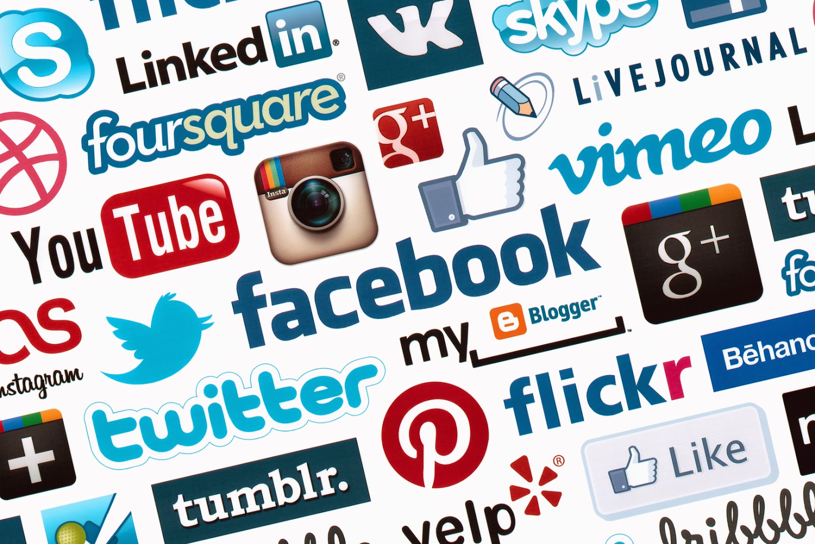
I have used social media platforms in order to publicise my work. I have used popular websites such as Facebook and Instagram to gain recognition for my music video and receive feedback from the public, suggesting ways in which I can improve various aspects of my products. Combined, these two social media sites have around 1.5 billion active users, a huge potential audience for my creations. This made advertising and requesting feedback through the use of social media a very effective exercise.

In conclusion, I have used a wide variety of technologies to help me in each stage of my work, utilising the powerful tools available to me to create the best possible work. I believe the media technologies I have used had a huge impact in the quality, presentation and end product of all of my work.


Evaluation - Question 3

What have you learned from your audience feedback?


My Target Audience (The perfect Viewer)


Fredrick Williams
Age: 21
Occupation: University Student
Job: Part-time restaurant waiter
Enjoys: Performing arts, Social media & pop music
About him: Fredrick enjoys his Uni life, and pursues him ambition to become a performer on the West End. Some may categorise Fredrick as a 'typical teenager', sharing his life on social media, going out with friends and a freunt listener to alternative pop music. Fredrick however pays less attention to music charts such as the UK top 40, and actively seeks to discover sound of the indie pop genre. He often shares his musical interests via his instagram account, where he interacts with others around the world with similar music tastes, and follows the bands he has an interest in.

Fredrick is the perfect example of the audience I am targeting with my media text. Specifically, my target audience lie within the 15-25 year old age range. I am targeting younger people with an interest in indie music and broadening their range or musical interests. My DigiPak, magazine advert and music video will all be centred around appealing to these people and encouraging them to engage in the media texts I have created.


--------------------------------------------------------------------------------------------------------------------------

Throughout the creation on my media texts, I have undertook a wealth of peer/audience feedback in an effort to improve my end product. I think by using this feedback at my disposer and acting upon it, whilst still keeping to the core ideas of my ideas, has made my products a success. I received feedback on my magazine advert, digipak and music video during my A2 year, of which I have taken on board and adapted each piece accordingly. Here is some of the feedback I received during the creation of each task:

DigiPak

Documenting the evolution of my DigiPak and all of its panels has been quite a journey, with frequent changes of ideas, various edits of chosen ideas and the finishing touches implemented on each of the 6 panels. Below is the almost unrecognisable design of my DigiPak showing my initial ideas for each panel. All but two panels are the idea I actually decided to incorporate in my final product, largely due to the wealth of helpful feedback I received from my peers.


This rough draft of what I intended my Digipak to look like was then converted into an electronic representation. This did not include the front cover or first inside cover due both my audience and me personally not liking the ideas for these panels, which can be seen above.


After another set of feedback I received urging me to rethink the idea behind the back panel too, I was ready to start constructing new ideas for each panel and developing into what I like to refer to as 'masterpieces'. The images provided below show a graphical changelog of each panel, showing how it has evolved from the initial panel idea to the final product through the feedback I received. Below each image states what changes I made to each panel as a consequence of audience feedback.


Once making all the adaptations shown above, I collated all of my final panels into one document, my 6 panel Digipak. I then asked my audience to provide some further feedback on my work.


Despite thinking my Digipak was then complete, after further feedback I received it was pointed out that they were not keen of the panel featuring the the couple holding hands, seemingly looking out of place and creating conflate with the rest of the Digipak's theme and colour scheme. This was also something I later identified as a problem. As a result, I instead incorporated another photograph I took on the day of filming, depicting a close up of barbed wire with the intention of reinforcing my encoded message of the music video that relationships are far from the perfect journey they are so often made out to be in other existing media texts. They can cause hurt, much like the intention of the barbed wire featured in this panel. My audience found some proportional issues with the tree trunk image, claiming it looked stretched. This was later solved by resizing it to its original proportions. The inclusion of the reworked panel, the edges bordering around each panel and fixing the proportional issues with the CD slot panel, completed my final DigiPak, which is exhibited below.


Magazine Advert

In constructing my magazine advert, I took a rather different approach. I created 3 ideas for my magazine advert, of which I let my audience decide which one they liked the most. Whilst keeping the design layout consistent throughout each idea, the text and photograph used varies between each poster. Beside each option I have listed the feedback I received in relation to it.

Positive Feedback
  • Nice text layout
  • A good amount of bleed at the edges

Constructive Feedback
  • Image to faded
  • Same image used on DigiPak only its flipped
  • Text looks to informal, scratchy and rough
  • Artist Name slightly out of position
  • Album name slightly out of position
  • Image of artist is too big for the canvas
  • Text does not match the font of the DigiPak


Positive Feedback
  • Text looks more professional 
  • Text is consistent with the Digipak
  • A nice gradient effect used
Constructive Feedback
  • Image looks like he's advertising a gardening show rather than a music album


Positive Feedback

  • Again, text looks more professional in comparison to the first idea
  • Text is consistent with the DigiPak
  • A nice, subtle gradient effect
  • Really like the image of the artist, which relates to the actual song
  • A clever fogging effect to improve the visibility of text
  • Well positioned text with suitable bleed
Constructive Feedback
  • The layout should be reshuffled so that the star ratings, critic quotes and 'Out Now' text are situated above the text listing some of the songs that feature on the album

An overwhelming majority of my audience chose idea three to be the most suitable choice. As a result, this is the design I chose to pursuit as my final magazine advert, after the implementation of the change(s) listed in its constructive feedback. Once again, using the constructive feedback enabled me to continually improve my work. This was no exception, with the result of these changes shown below in my finalised magazine advert.


Music Video
By taking on the feedback I have received at every stage of producing my music video, the product has evolved into what it looks like today. However, whilst sharing some similarities, my initial idea was a far stretch from what the end product turned out to be. This is thanks to the constructive contribution of my audience. The feedback I received form my initial idea from my music video along with my first storyboard can be seen below. The video was recorded immediately after my pitch, and enables me to reflect on the feedback I received and how to act upon it.


The feedback received was very useful, and suggested the following adaptations to my rather vague concept idea. The three key points we are as follows:
  • Revise death ending (the death of a relationship rather than a literal death)
  • Possibly portray the people in the relationship growing up
  • Rethink the structure of the narrative


This first set of feedback game some direction to my ideas, being able to generate a far clearer image of what I would like my final product to look like. Whilst tweaking my narrative to accommodate these suggested changes, I quickly moved on to filming the performance element of my music video, something my peers agreed was a good idea. As seen in my animatic, the performance element is mixed with my narrative to create a range of interesting shots, incorporating my artist and his band singing along with telling a fragmented story throughout. My first music video draft visualised only my performance footage, having yet to film any narrative due to the feedback I received. Narrative footage would later replace the black spaces between the performance clips. Despite this being, as the title describes, a 'very rough music video draft', I believe it was a huge stepping stone in identifying the progression of my work.


The verbal feedback I received from the audience viewing this draft was generally very positive. Peers and family members commented on the camerawork, and how they enjoyed the smooth sweeping motion implemented on each clip. The video gave me a strong structure of narrative, of which I could then include my revised narrative. The critical feedback I received for this piece was rather pointing out the obvious. The two key themes of critical feedback I received from people who had just viewed my first draft were to:
  • Add a narrative to the music video (fill in the black spaces)
  • Find a conclusion/climax for the video
As you can see through my second draft, which can be viewed below, I took this feedback in my stride, using it as an opportunity to sculpt my video around my target audience. After scrutinising my storyboard and rebuilding the content and structure of the tale of the relationship, I now had the opportunity to film and include my narrative footage built upon my previous draft. Here is the result.


My second music video draft was another successful stepping stone toward my product. Again feedback was very positive, yet constructed. This feedback can be heard below via a voice recording I took, documenting my audiences thoughts and ideas surrounding the piece  listing elements of the product they do and bits that they feel need work.


The feedback was once again invaluable, giving me an insight as to what I must achieve to reach a high grade. Whilst many people enjoyed the piece in its current form, what can only be described as perfective maintenance was suggested in order for me to reach the next level, and capitalise on the professional look and feel on the video. As a result of my audiences trained eyes, the adaptations suggested were as follows:

  • Longer flying picture footage
  • Fix or re-shoot grainy footage (Colour Grade - Hint of Sepia?)
  • Tripod very briefly in frame
  • Remove the shadow which can be seen on one tracking shot (expand footage area)
  • Fix sync issues
  • Resolve slightly Anticlimactic finish
  • Include Keyboard shot

Once again I completed the cycle of receiving audience feedback and making the required changes to my music video. This cycle has really benefit my end product, something that is evident in the video below. From the feedback I consequently:
  • Incorporated more reverse flying picture footage
  • Colour graded all footage
  • Reduced grain on some poorly lit footage
  • Removed sightings of the tripod and my shadow
  • Fixed audio/lip sync issues
  • Included more shots of the instruments
  • Constructed the ending to the video
Making these changes gave me a music video I could be proud of. I really hope viewers within and outside of my target audience enjoy my work and can see the great lengths I have gone to in order to make the end product look like it does. You can see my music video below. I am still open to further feedback, explaining what you like and don't like about the video, knowing full-well the importance audience feedback has had in affecting and improving my work.


Evaluation - Question 2

How effective is the combination of your main product and ancillary texts? 

I have created my digipak and Magazine advert in line with existing real media texts. Upon researching into the common layout and features of a magazine advert, I was able to create a striking, professional looking piece which combined my findings from initial research with my creativity. The result can be found below, my final magazine advert and final digipak:


My magazine advert includes:
  • Artist Name  -  Brad Orlando
  • Album Name  -  Transience
  • Star Ratings  -  5 Stars
  • Critic Quotes  -  An instant classic & Songwriting genius
  • When the album is available  -  Out Now
  • Record Label  -  XL Recordings
  • Social media links  -  Facebook: /BradOrlando   Twitter: @BradOrlando
  • Website  -  www.orlandomusic.co.uk
  • Featured music  -  Featuring Laughter Lines, Resistance and Falling
  • Artist Image 

My DigiPak includes:
  • Artist Name  -  Brad Orlando
  • Album Name  -  Transience
  • Record Label  -  XL Recordings
  • Website  -  www.orlandomusic.co.uk
  • Song Names
  • 6 Images
  • Barcode
  • Copyright Information
Images
Having taken the all photographs featured on magazine advert and digipak on the day of filming, all images tie nicely with the music video it relates to. Everything from the lighting to the artists clothing in the each image match that of the music video. Many of the images used also depict the forest where the performance element of the music video was filmed, again creating a nice combination between the advert, digipak and music video. 

Text
I have opted to use a simplistic, thin, typewriter like typography to keep a minimalistic theme throughout my ancillary task. The font used is consistent throughout my magazine advert and digipak, with all text white in colour and incorporating bold and italic on text I want to emphasise. The artist name and album title are clearly listed toward the top of the advert, once again sharing many similarities to the format of my digipak. I believe this consistency across my ancillary tasks in terms of typography is one of the reasons for its succession in creating an effective combination with my music video.

Record Label
The record labels imagery, such as their company logo and name, has been used on both ancillary tasks, providing them with recognition and informing users of the copyright protection implemented on the albums songs. I have changed the colour of the logo and added elements of transparency in accordance to the design of each panel it is present.

Theme
I stuck to a bright, nature orientated theme to accompany my music video. This theme is continual throughout all of my work, and integral to how well each piece work with each other. Each image has been selectively chosen and edited to conform to my theme and effortlessly align with surrounding images. By keeping to a strict colour scheme of an earthy brown, green and white and putting great importance in standardising the design layout, I was able to create an integrating set of work rather than three separate creations. 

Creative Decisions
Magazine Advert
As I am advertising Brad Orlando's second album through my magazine advert, I opted to select an image of him looking away from the camera rather than looking straight at it, to give him more of a thoughtful look, potentially reflecting on the recent break up of his relationship. I believe the image I have chosen is effective in creating interest around the album, and completes the clean, professional I was going for. In light of further research into existing magazine adverts, I reorganised some of the text, swapping around the artist name and album name, and placing the 'Out Now' text below the critic ratings to. I also added appropriate critic names to the present quotes, ones which would be likely to review in relation to the songs genre (like 'Q'). A full changelog of my ancillary tasks is available in a previous post.

DigiPak

Front Cover:
The front cover of my album provides a face-on close up of the artist to fulfil the needs of the record label, creating brand recognition around my artist. I used the suns natural light to accentuate the artists hair, providing a natural hair light. The artist name and album name follows the same font and a very similar layout to the same text found on my magazine advert to ensure consistency. I further blurred the background to maintain focus on the artist and ensure text is easily readable.

Back Cover:
The back panel of the DigiPak lists all of the albums songs, curving around a leaf. This idea was formed in the interest of keeping in line with my nature theme. Song names are stylised in italic, and are evenly spaced from the leaf and each other, giving the panel a professional, organised look. The back cover also incorporates the record labels logo and the necessary copyright information, describing the protection that is implemented on the songs. I also chose to include the artists website for maximum publicity and a discrete, non-intrusive barcode with elements of transparency, all following my white text colour scheme. The more trained eye may be able o notice that I added a filter over the top of the image to make it look a bit more rough and 'earthy'.

Inside Cover:
Much like my magazine advert, I decided to include an image of my artist looking thoughtfully into the distance in relation to his recent break up, which is portrayed in my music video. This panel also includes a thank you message to all of Brad Orlando's fans and the people who have helped him to produce the album. The decision to include this feature came after the in-depth research into the conventions of DigiPak's. I have adjusted the text to fit around the subject of the image, much like I have done for the back panel, only this time the text surrounds my artist rather than a leaf. Text is evenly spaced out to maintain the organised look.

Second Inside Cover:
The second inside cover incorporates nothing else but a picture of the spikes of barbed wire, shot with a very shallow depth of field. I used Adobe Photoshop to play with the contrast levels of the image to give it the striking look I have achieved. The image is meant to represent the troubling, hurtful times within Brad Orlando's relationship and relationships in general. I believe this panel is one of the more powerful ones in getting my hegemonic message(s) across, providing a nice contrast between the beautiful, natural forest and the unsightly, man made contraption with that has the intent to cause hurt.

CD Slot:
My CD slot panel sports a tree stump. I once again used Adobe Photoshop to highlight the sharpness and colour of the image. The panel maintains my nature theme and even relates to the lyrics of my song ('to see the tree they cut down 10 years from your birth'). The photograph also goes some way in telling the age of the tree, further linking to the lyrics of Laughter Lines ('brushed out hand right back in tim through centuries'). 


Third Inside Cover:
The third and final inside cover features a tree bark, a photograph sharing the same shallow depth of field characteristics as many of my other DigiPak panels. Keeping to the font styles I have used throughout my ancillary tasks, I have also included a set of key lyrics associated with the song Laughter Lines. This panel completes the nature theme and capitalises on the design consistency across all of my work.


Due to this consistency, I believe I have been very successful in creating a DigiPak, magazine advert and music video which all relate very well. By keeping to personally set standards, I was able to create a complete package following a specific theme which effectively combined this years final products.


Tuesday 24 March 2015

Evaluation - Question 1

In what ways does your media product use, develop or challenge forms and conventions of real media products?


In this question I will be looking at the meaning through conventions I developed within my A2 music video. I believe the creative decisions I made in following, developing and challenging existing conventions played a key role in the success of my final piece, and is definitely a talking point concerning what conventions I used to portray specific meanings and encoded messages. Exemplars of a number of conventions can be seen woven into the fabric of my music video, of which I have demonstrated below. I have compiled 9 key shots from my video in the image below, identifying where I have conformed or challenged a specific convention currently used in real media texts.


My media product ‘Laughter Lines’ conforms to and challenges an array of different music video conventions. The video combines a performance element from my artist Brad Orlando, following the break up of two people previously in a relationship, played out in reverse. However rather than spoon feeding my audience a chronological narrative, I incorporated the distinctive music video convention of narrative disjuncture. Opposed to the continuity, story-telling nature used for last years thriller opening, my music video requires my audience to piece the fragmented narrative together in order to create a personalised meaning. This follows the theorist Vernallis, and her idea that music video narratives are unique to other media texts in the sense that they rarely ever follow a story and incorporate a very fragmented narrative. This convention gave me creative freedom, enabling me to encode a variety of messages, of which viewers can intentionally perceive in many different ways, relating to another theory known as Stuart Halls perception theory.

Encoded messages are also existent in my music video, even from the very first shot. The broken glass, ripped photographs and broken stick all subtly represent thebreak up of the relationship, a message dismissing the artificial 'happily ever after' theme that many videos undertake and provides a harsh insight of the reality of most relationships. These almost hegemonic messages give a slightly deeper meaning to my music video for audiences not just to intake my work at face value.


The second shot highlights my conformity to artist close-ups, another very important element of real music videos and my music video alike. A music video, as well as focussing on being visually interesting, should be centred around the artist and therefore play on the star image of, in this case, Brad Orlando. The demands of a record label often request a number of artist close ups to build a recognition for them. The demand for artist close ups is prominent in works like MAGIC!'s 'Rude'. My music video is no exception as I have consciously included many close ups of my artist within my music video, following the conventions of many existing media texts and again the ideas of Andrew Goodwin in what can usually be found within a music video. I believe being such a prominent feature in existing texts, my own work would benefit from close up shot of the artist.


I adopted existing conventions within the music video industry not only through the editing and post-production, but through the shots I achieved whilst filming, using a typical camera technique referred to as the 'over the shoulder shot'. This enabled me to portray a conversation or rather ann argument within my music video , showing one individuals shoulder in the foreground whilst focussing on the individual opposite them. This shot is utilised in a range of texts, often in partnership with the 180 degree rule, something I also incorporated into my own work. Using these conventional shots enabled me to clearly depict the communication between Brad Orlando and his partner via my camerawork.


One of the most notable differences of a music video to other media texts is the pace of editing. In general, editing is fast paced and each shot last no more than 3-4 seconds. Often called 'Montage Editing', the significance of the past paced cuts made it hard to ignore. This convention I have embraced along with cutting to the beat, what I consider to be a technique iconic to the conventional music video. Timing my transitions to the beat of the music helped me achieve a professional end product which seamlessly flows with the soundtrack the visuals partner. This again provides evidence in ways in which I have accepted conventions seen in real media texts in order to improve my own and displays evidence of Andrew Goodwin's theory outlining the common link between audio and visuals, a theory that is further reiterated with the multiple shots of the supporting band playing their instruments.

Theorist Andrew Goodwin also identifies the common link between the song lyrics and visuals. This is demonstrated by the fourth screenshot, where a calendar page is being ripped off the calendar, but played in reverse. We see that we are going back in time, as February is replaced by January  strongly relating to the accompanying lyrics, frequently referencing going 'back in time'. This relationship between lyrics and visuals make a frequent appearance in many modern music videos with similar genres, with 'King' by Years and Years a good example.

The combination of performance and narrative is possibly one of the more generic and evident conventions of music videos, yet very important regardless. Whereas some videos compile of just a performance element, much like MNEK's 'Please don't call this love', I stuck with the conventional mix of narrative to accompany my artists performance. This helped me achieve a variety of shots, scenes and aesthetically pleasing features.


As previously mentioned, the use of camerawork was also used to adhere to music conventions. This rings true with my camera movement throughout my piece. In an effort to keep every shot interesting and dynamic, I have a great deal of sweeping camera movement with the help of a steadicam. This is common of music videos, with MNEK's 'Every Little Word' being a prime example of the importance of camera movement has over the visuals. The screenshot used above is taken from 3:05 of my music video, just one of the many shots which incorporated fluid, freehand movement for maximum visual pleasure.


Music videos almost always integrate many different costume and location changes throughout. My music video narrative features two main characters, both of which change clothing once, twice and even a third time for my artist Brad Orlando. These costume changes are common of the genre of the song and music videos in general, and used in my video to demonstrate the change of scene and timeframe. This is also true with the changes of location within my and the vast majority of existing music videos. My video features a total of 4 location changes, ranging from both performance and narrative clips. This conformity to real media conventions contributes to my work achieve one of the core measures of success in creating a music video, to make it visually interesting.


Finally, intertextual references have influenced the creation of my music video. In preparation of the production of my own music video, I watched a wide variety of existing music videos of all eras and genres, one of which was 'Mine', a song by Taylor Swift. Despite being a seemingly unlikely source of inspiration, the 2010 music video ignited the idea of holding the performance element of my video in the forest, and the inclusion of photographs representing the artists memories. In fact the video also inspired the shot seen on the left. Shots within Taylor Swifts video, much like the one at 1:12 and 2:19, provided some significant inspiration. Watching this video evolved a number of ideas which I have incorporated and benefit my final product.


My knowledge and understanding of media conventions can be seen clearly through my music video. Rather than basing conventions used blindly on clichés I have picked up from watching other media texts, I can now identify and be selective over each of the conventions I decide to use in my own video productions in order to create the desired effect. As I now have a far more developed understanding of existing media conventions surrounding music videos, I have been able to demonstrate this through my A2 work.